Thanks, Jennifer, for a terrific tutorial and inspiration for this lover of many layers!
Here's what I came up with:
Here's what I came up with:

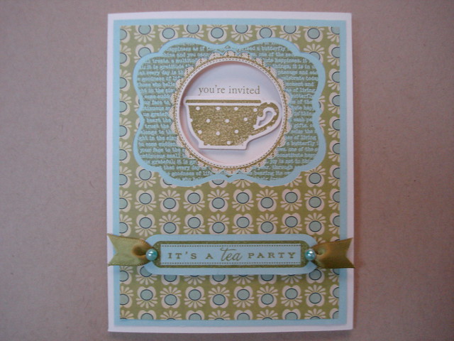
Talk about a challenge! I worked on this project for many hours over the last few days and spent most of yesterday just staring at it! I like the finished card but it is so different from what I usually do, it seems like someone else made it! It definitely has a homespun vibe. You may notice the deliberate omission of the glittered overlay of the focal point; while I love the technique, and will definitely use it in the future, I could not see it working here. I really wanted the focal image to remain crisp and clean. I wish I could give it a name...do you have any suggestions? I'll listen to anything but "Lame card!"
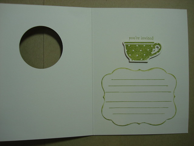
I stayed with Jennifer's basic layout but started with this cute paper from the Social Club Mini Deck by Cosmo Cricket. My first die cut is with Mat Stack #4. (Patterned paper for the top layer was the first step out of my comfort zone.) But, I do love the color combo here so the second layer is Aqua Mist card stock cut with the scalloped circle die from Limitless Layers collection and stamped with the text background from Mat Stack #4 stamp set using Ripe Avocado ink. The card base, in Vintage Cream, is stamped with the herringbone background from Mat Stack #4, which of course only just peeks out as a scalloped border around the focal point teacup from Tea for Two Additions. "You're Invited, and "It's a Tea Party" are from Tea for Two. The front of the card is finished with Ripe Avocado ribbon run through punched holes in the ends of the little hand cut tag, and embellished with Hero Arts pearls colored with Copic Markers. The beribboned tag, as well as the teacup focal image are raised up on dimensional foam adhesive. Inside the invitation, as seen below, I added another Mat Stack #4 die cut in matching Vintage Cream and stamped it with journalling lines from Mat Stack #1 in Ripe Avocado ink. The edges are swiped with the same ink. for a little definition. I thought a few lines would help keep handwritten party details neat and tidy.

Just to be clear, all of my supplies except for the patterned paper and pearls are from Papertrey Ink, my favorite resource! Shameless, aren't I?
By the way, did you notice that I now have an e-mail subscription option? Thanks for the suggestion, Dana, and for telling me how to do it.
Stay cool, Girlfriends, and please let me hear what you think of this little homespun number!
Thanks for stopping by,
Suzanne

I think it's fabulous Suzanne! Love everything about it. xx
ReplyDeleteThis is really pretty, I like the soft color combo!
ReplyDeleteDefinitely NOT lame! ;-D Very, very pretty. I love all the delightful patterns, and the color combo is beautiful. Love that you did the inside, too. Great job on the decreasing apertures technique. ;-)
ReplyDeleteThanks for stopping by my blog and taking the time to comment!
Very pretty card. I like how you placed an area inside the card to write your personal sentiment. Clever! I love PTI.
ReplyDeleteThis is so soft and pretty and nobody would call it lame! Gorgeous.
ReplyDeleteHugs
Carol x
What a pretty card, love the colors and the layers, also the inside is great. I agree on the overlay, I left mine off as well. I am becoming a PTI follower now, love it all :)
ReplyDeleteLove PTI and love this card the papers are so lovely and that little cup is to die for....
ReplyDeleteKaren
www.littlescrappieces.blogspot.com
very cute invite!! you did great!
ReplyDeleteGreat card. I especially like the ribbon treatment on the label.
ReplyDeleteYour little homespun number is AWESOME, Suzanne!!! Great job!!! I sooo wanted to do this MIM too, but I'm pretty limited on PTI's dies, sadly. Even more sadly, my SAF order seems to be in limbo as I'm still waiting an actual shipping notice -- sigh! Soon, I hope?!
ReplyDeleteIt's a great card! I really like your patterns and textures, and the ribbon is particularly yummy!
ReplyDeleteThis is very pretty! I love how you've used the teacup with the Matstack and the colors and designer paper are wonderful!
ReplyDeleteAdorable! Love the inside.
ReplyDeleteJust had time to look through your blog, you have really beautiful work here, sorry couldn't comment on them all, but HAD to say about your work.
ReplyDeleteThis card another fabulous one of yours, love what you have done with it and the colour combo is gorgeous too.
This is just the cutest - who wouldn't want to go to a tea party if the invitations are like this?
ReplyDeleteLove the pretty colour combo and that popped up teacup is perfect.
Caroline xxx
Hours well spent, lovely card. The papers and colours are perfect.
ReplyDeleteLove this card oh so stylish with such great images and colours.
ReplyDeleteMarie