Monday, August 29, 2011

Card Pattern Sketch 130 & Color Throwdown 156


Hello Everyone and Happy Monday to you!


This project was a first time sketch challenge, a first time to use this color combination, and a first time to use NO ink!  So, I am particularly curious as to what you might think of it.  I will look forward to your much appreciated comments!  


In my stash of patterned papers, I found this 6" pad from Kaiser Craft called  Lilac Avenue Collection.  It not only has a variety of pretty papers, but 28 die cut elements.  I stacked two of them under the center flower.  The striped background as well as the soft yellow pattern under the two side flowers are also from this collection.  The roses were made using My Favorite Things Rolled Roses Dies.  The scalloped squares were made from Spellbinders Big Scalloped Squares, large.  I also used Papertrey Ink's Eyelet Lace Scallop Border die which I cut in half and adhered to either side of the horizontal strip across the center of the card.  All cardstock is from Papertrey Ink in Kraft, Lemon Mist, and Plum Pudding. 


photo


Thanks for stopping by!
Suzanne

Saturday, August 27, 2011

CASE Study #54 and...


Signature Style...inspired by a sticker


I was stumped when I received the e-mail saying that the CASe Study #54 was about Signature Style.  I took out a variety of my favorite cards from my stash and have spent the last two days staring at them.  Which of these really characterizes MY Style?  Nothing was coming to mind...then I got the e-mail from CASual Friday about using stickers.  Well, I have a grand total of 4 sheets of stickers, all alphabets with a few images thrown in.  Bought them all on sale because stickers are something I should have on hand as a card maker, right?  


My little self-conscious mind was spinning nervously as I noticed the word "Paris" and I finished the thought with "is always a good idea".  (A quote I recently heard by Audrey Hepburn)  And Voila!  My happy memories of a recent trip to Paris with my Sweet Hubby translated into this card.  We had dinner at Le Jules Verne, the fabulous restaurant inside the Eiffel Tower.  We sat next to a window and watched the sun set over Paris as The City of Lights came to life.  Ooh la la, tres magnifique!!!


I'm still not sure what my signature style is, but I thought a handwritten sentiment would be an interesting take on the challenge.  Get it?  Signature?  Oh well.  


So there you have the convoluted process I went through to get to this:

photo

Au revoir, mes amies!

Details:
Cardstock:  PTI Fine Linen and True Black
Stamps:  Hero Arts CL325
Ink:  VersaMark, Memento Tuxedo Black, PTI Smoky Shadow (aged effect)
Sticker:  The Paper Studio
The tiny hearts are die cuts from Tiny Tags Die (PTI), colored with Copic Marker RV17, and sparkled with Martha Stewart Crystal Fine glitter
The handwriting is done with an extra fine black rolling ball pen by Pilot

  Those of you in the northeast, I am praying for your protection and that you will take all of the precautions necessary regarding the hurricane bearing down on you.  Please be safe.

Thanks for stopping by, 
Suzanne

Thursday, August 25, 2011

August 2011 Bloghop at Papertrey Ink

The-Challenge
August Blog Hop Inspiration 

Isn't this a beautiful inspiration?

Here is my take on the challenge:

photo


Details:

Cardstock-PTI, Vintage Cream
Designer Paper- Bitty Blocks, Pure Poppy and Spring Moss
Ink:  Pure Poppy, Memento Tuxedo Black
Stamps:  sentiment, Gratitude Journal/ flowers, Flowere Fusion #1 & All About You/ flourish, Mat Stack #2
Dies:  Flower Fusion #1, Turning a new Leaf, Mat Stack #1

Thanks for stopping by, 
Suzanne

Tuesday, August 23, 2011

Color Throw Down#155 & Make It Monday#29 Freestyle Copic Coloring


Hello and happy Tuesday, my Blog Buddies!  


I  have a quick post for you today which combines the Color Throw Down challenge with Make It Monday from Nichole Heady's blog for Papertrey Ink!  This was a lot of fun and challenging since I am not one to "color outside the lines".  As you can see I created my own lines with Copic Markers and that's about as far as I can go in freestyling!  


Do you love the new Bloom Builder Die from PTI?  I do!  You may see that fluffy floral embellie on many of my cards to come.  There is definitely a learning curve on successfully removing such an intricate cut from the card stock.  I did not get it on the first try.  I even lost a couple of petals in the process but the good news is that it really doesn't matter once I put the layers together.


Here are the colors for the Throwdown:


and here is my card:

photo

Details: (all PTI unless noted)
Card stock:  Lemon Tart, Dark Chocolate, Simply Chartreuse
Dies:  Bloom Builders #3, Sending you (leaves), Spellbinders Large Circles
Ribbon:  Raspberry Fizz
Stamps: "Miss You" from Tiny Tags,  "Hello" from Hero Arts CL 483
Ink:  Memento Rich Cocoa, Versamark
Embossing Powder:  Leaf, by Zing!
Copic Markers:  YG13, RV17, E59


Thanks so much for stopping by today!  I hope you have a great rest of the week.  

Happy stamping!
Suzanne

Sunday, August 21, 2011

CAS-ual Fridays Challenge #16


Welcome back to CAS-ual Fridays, 
The Clean And Simple Challenge!

CFC16:  Create a Clean And Simple project that features embossing--dry embossing, embossing folders, or heat set embossing.

I was so delighted when I saw that this challenge was all about embossing!  It was heat set embossing that first caught my interest and launched my passion for paper crafting two years ago.  While this project uses the dry embossing technique, it is no less a favorite of mine.  I hope you will like it!
 

photo


The finished size of these personal note cards is 3 3/4" square so that I could use my PTI 4" square envelopes AND it just happens to be the size of the largest Nestabilities, large squares.  I used three different sizes of the square dies to get this deeply embossed look.  The center card has a base of Soft Stone, matted with Kraft  while the image is stamped on Vintage Cream.  The other two cards have Vintage Cream base as well as the center image.   The artichoke design is from Stampin' Up!, Homegrown.  I really had fun stamping the image in different colors of ink and then applying a combination of Copic Markers, and colored pencils from Martha Stewart to create a deeply shadowed image.  The pencils leave a subtle sheen even when colored with the Copics.   The matting on the other two, Tan Leather from Gina K. Designs, and Smokey Shadow from PTI, respectively, were chosen to coordinate with the finished image.  I think you are not able to fully appreciate the center one from the picture, but it is my personal favorite because of the muted but sophisticated color palette.  

I would love to hear your thoughts! 

Thanks for stopping by,
Suzanne  

Friday, August 12, 2011

August Birthdays

Hi There!  So glad you came by today.  Do you have your coffee?  Have you been to the bathroom?  I  think you may want to get comfy before you start this LONG blog post today.  I have lots of friends and family with August birthdays.  Today is my sweet hubby's 59th and my brother is turning 70 on Sunday.  We are leaving in the morning for a surprise visit to celebrate this big one with him in Tennessee. 

I have a lot to share so lets get started!

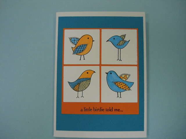
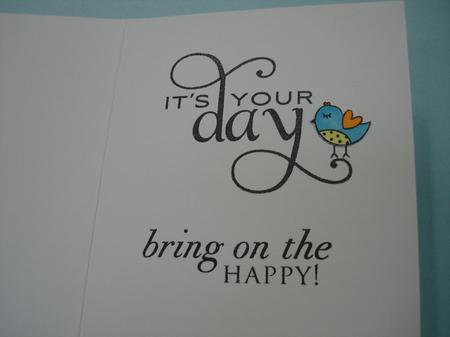
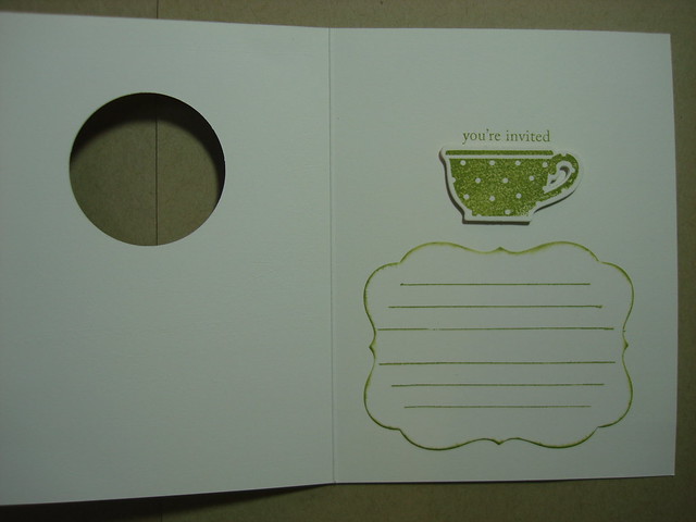
Yesterday's birthday celebration for my friend Jan included a girl's night out to see The Help.  Afterwards, we had some cake and a glass of wine while she opened some presents and my card for her.  She loves and wears bright colors and this happy little card seemed perfect for her.  It's one I have had in my stash for a while now, but I had never finished the inside until I decided it was for Jan.

photo

photo

The card front is made up of a sentiment and this set of four birds from HERO ARTS as well as the little bird on the inside.  The inside has a double sentiment because I just love both of them and I think they fit well together. (PTI-Think Big Favorites #2 and Big Birthday Wishes.)  Card Stock is PTI- White, Hawaiian Shores, Orange Zest.  Memento Tuxedo Black ink was used for the sentiments.  The birds were colored with Copic Markers. The white squares were die cut with Spellbinder's-Nestabilities.

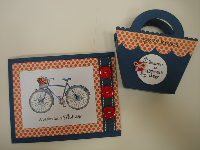
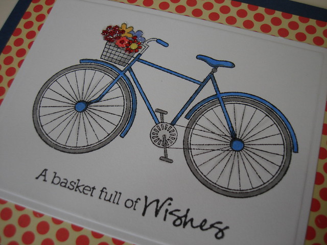
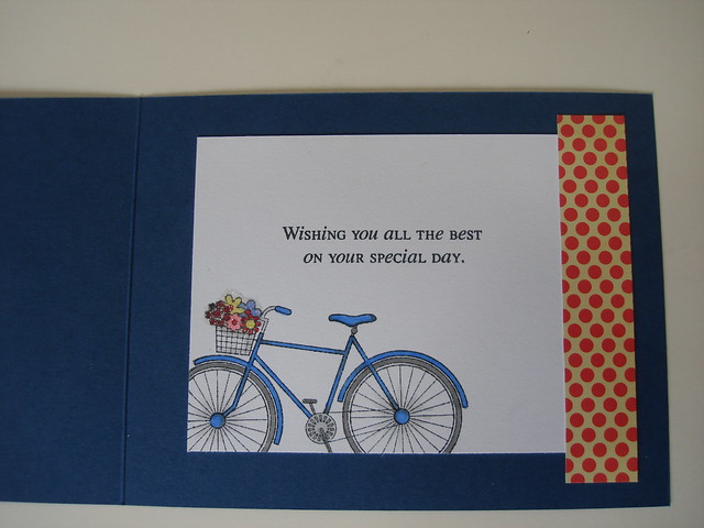
The next  set is for my hubby's birthday buddy and employee, Karen.  She rides her bike to and from work and always has a dish of candy on her desk so I was delighted when this all came together.  She was very pleased to receive "Hugs and Kisses" from her boss, especially, the Hershey's kind that filled the little basket.


photo


photo

Can you see the flowers in the basket?  I added a little glitter there and some Sakura glaze pen to the blue of the bicycle to brighten things up a bit.

And here's the inside:

photo

  
Details:  PTI-Enchanted Evening, White card stocks, Birthday Basics (interior sentiment), medium scallop border die,   Favor it Box #2, Enchanted Evening Ribbon, Pure Poppy Vintage Buttons, Jute Button Twine,   Cosmo Cricket-polka dot paper,  Unity Stamp Co.-A Basket full of Wishes (sentiment and bicycle), Copic Markers, Martha Stewart-Crystal Fine Glitter, Hero Arts- Hugs and Kisses, Have a Great Day, Sakura-Clear Glaze Pen, Memento-Tuxedo Black ink


The next one you may recognize from the cover of the current issue of Card Ideas for Paper Crafters.  No, it's not my card on the cover!  But what a fun card to make for my brother's special birthday celebration!  Much thanks and admiration to Beth Matson, designer of this fab card!  Here's my version:

photo

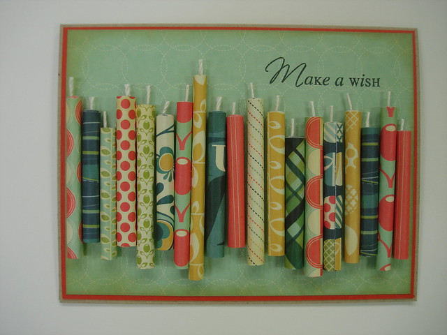
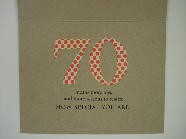
I added a mat layer in PTI's Terra Cotta Tile card stock and used almost every pattern paper from Cosmo Cricket's Social Club mini deck.   I thought it would take a really long time to roll all of the candles, but it was very simple and the process went quickly.  I rolled them around a wooden skewer as Beth suggested and used some Zig two-way glue to hold it firmly.  When I attached the candles to the card front, I used 1/8th inch Scor-tape along the seam side because the small round shape seemed to need some really secure adhesive.  I think it was a good choice.  This card base is PTI's Kraft, the sentiment is from Make a Wish stamp set and stamped in Memento Tuxedo Black ink.  The edges of the patterned paper layer are inked with PTI -Tea Dye Duo-Chai ink 

and inside...


photo

I repeated one of the pattern papers from the front to die cut the 70 using PTI's By the Numbers die set.  The sentiment is from Big Birthday Wishes.

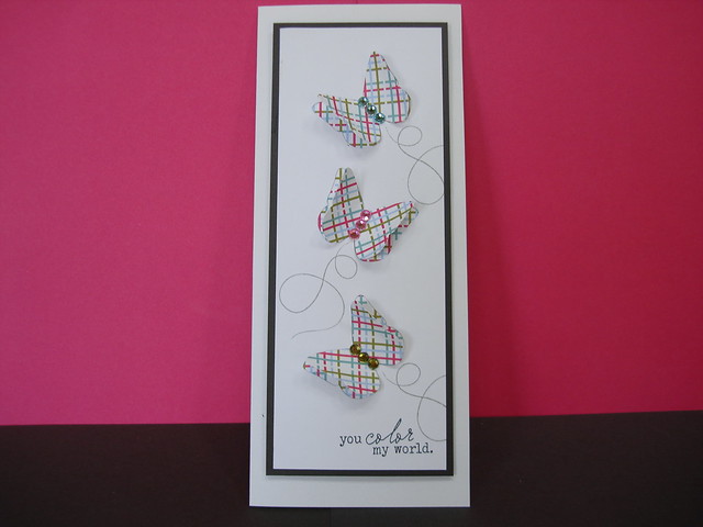
And in conclusion...

photo

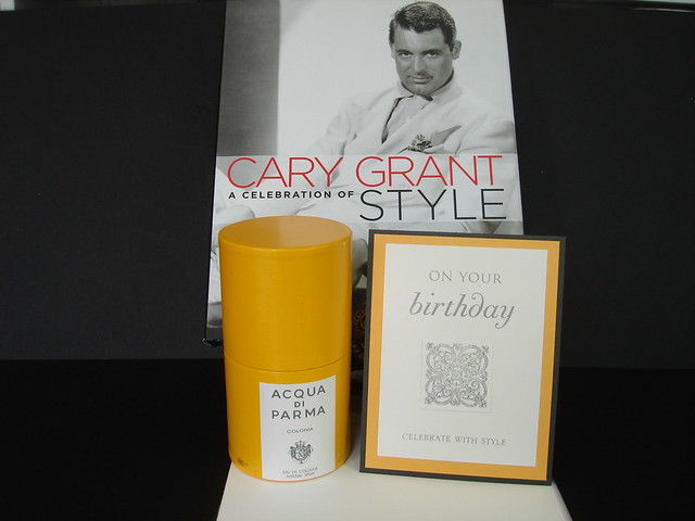
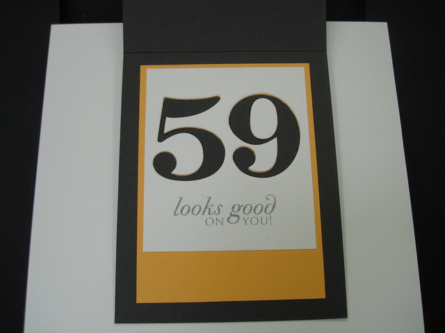
Birthday gifts for my Sweet Hubby!  Girls, turning 59 is quite a milestone.  I know because I did it back in May of this year.  There is a whole new perspective on life and living it well on this side of the mountain.  So Sweet Hubby's birthday this year is all about living in style!  Cary Grant being our style icon, Sweet Hubby chose a fragrance worn by the handsome devil himself and a book looking back at the man, his movies, and, as the title says, a celebration of his unique style.

The handsome round box containing the new fragrance inspired the card.  PTI-Smoky Shadow, Summer Sunrise, and Vintage Cream card stock.  Stamped with Smoky Shadow ink using Big Birthday Wishes, and Big & Bold Wishes.  The architectural design is from Technique Tuesday.

photo

and inside 


photo

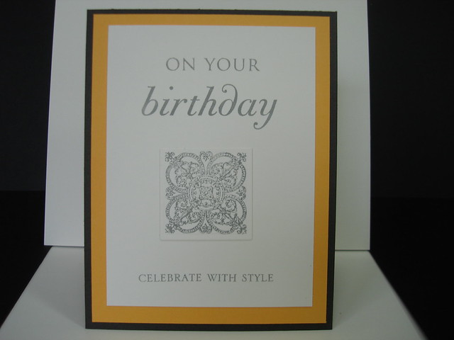
Again I used By the Numbers dies set.  It was a little tricky to cut through both layers of card stock with the dies but it worked.  I ran it through my Big Shot twice and very gently separated the cut out pieces and it turned out rather well.  I made the mistake of removing the removable tape before securing the two layers but I think I like just the hint of Summer Sunrise peeking through atop the Smoky Shadow.

Whew!!  Lotta words...Lotta cards....Lotta fun making them!  Thanks for sharing this fun with me.  Please let me know if you have a favorite and as always, I would appreciate your constructive criticism.

Thanks for stopping by, 
Suzanne

Monday, August 8, 2011

CASE Study Anniversary Blog Hop CSC 51

Inspiration from any of the designers-past or present!  I couldn't choose between Amy Wanford and Cristina Kowalczyk!  I loved Cristina's abstract butterfly and Amy's soft, delicate colors and I had never used my Modern Basics set from PTI....so, I chose Amy's inspiration based on Cristina's inspiration and came up with this!


photo

photo

The second picture here gives you a better idea of what is going on with this card.  The white embossing on three of the butterflies and the sparkle outline (from a Sakura star pen) on the others as well as the sentiment, keeps the images from being utterly flat.  The grey mat is also outlined with the Sakura star pen-one of my favorite embellishing tools.  I was a little disappointed with the imperfection of transfer of the sentiment but the star pen helped give it more definition.  This is not one of my most satisfying projects and probably has a  lot to do with the incredible style and execution of the cards I CASED!!!  

I so much appreciate their examples and ongoing inspiration.  Thanks, Chupa for making this fabulous blog site available to all of us wanna-bes!

Card details:
Cardstock:  White, Smoky Shadow, Sweet Blush, (PTI)
Stamp Set:  Modern Basics, (PTI)
Ink:  Smoky Shadow, (PTI), Versamark
Other: White Gelly Roll pen, Star pen, (Sakura), White embossing powder, (Stampendous), dimensional foam adhesive, (Scotch brand)

I would love to hear your comments!

Thanks, for stopping by,
Suzanne

Sunday, August 7, 2011

Color throwdown #153

Hello one and all!  I'm so glad I made it just under the wire.  Here's my entry for this challenge.

photo

I was delighted when I saw the colors for this challenge, it is one of my all time favorite combos!  I started with a white card base, layered with Kraft, and the blocks are Ripe Avocado and Aqua Mist; all PTI card stocks.  The other details are below. I hope you have a chance to leave a comment for me at this late hour!  I'll try to get my entries in a little earlier in the week next time!

Thanks for stopping by!
Suzanne

All supplies are Papertrey Ink except Versamark Ink, white embossing powder by Stampendous!, opaque white gel pen by  Sakura.
Stamps:  Flower Fusion #6, Birthday Basics, 2011 Birthday Tags
Dies:  Flower Fusion #6, Wonderful Words


Thursday, August 4, 2011

Make It Monday #26: Decreasing Apertures

Thanks, Jennifer, for a terrific tutorial and inspiration for this lover of many layers!


Here's what I came up with:


photo


Talk about a challenge!  I worked on this project for many hours over the last few days and spent most of yesterday just staring at it!  I like the finished card but it is so different from what I usually do, it seems like someone else made it!  It definitely has a homespun vibe.  You may notice the deliberate omission of the glittered overlay of the focal point; while I love the technique, and will definitely use it in the future, I could not see it working here.  I really wanted the focal image to remain crisp and clean.  I wish I could give it a name...do you have any suggestions?  I'll listen to anything but "Lame card!"


I stayed with Jennifer's basic layout but started with this cute paper from the Social Club Mini Deck by Cosmo Cricket. My first die cut is with Mat Stack #4.  (Patterned paper for the top layer was the first step out of my comfort zone.)  But, I do love the color combo here so the second layer is Aqua Mist card stock cut with the scalloped circle die from Limitless Layers collection and stamped with the text background from Mat Stack #4 stamp set using Ripe Avocado ink.  The card base, in Vintage Cream, is stamped with the herringbone background from Mat Stack #4, which of course only just peeks out as a scalloped border around the focal point teacup from Tea for Two Additions.  "You're Invited, and "It's a Tea Party" are from Tea for Two.  The front of the card is finished with Ripe Avocado ribbon run through punched holes in the ends of the little hand cut tag, and embellished with Hero Arts pearls colored with Copic Markers.  The beribboned tag, as well as the teacup focal image are raised up on dimensional foam adhesive.   Inside the invitation, as seen below, I added another Mat Stack #4 die cut in matching Vintage Cream and stamped it with journalling lines from Mat Stack #1 in Ripe Avocado ink.  The edges are swiped with the same ink. for a little definition.  I thought  a few lines would help keep  handwritten party details neat and tidy.


photo


Just to be clear, all of my supplies except for the patterned paper and pearls are from Papertrey Ink, my favorite resource! Shameless, aren't I?


By the way, did you notice that I now have an e-mail subscription option?  Thanks for the suggestion, Dana, and for telling me how to do it.


Stay cool, Girlfriends, and please let me hear what you think of this little homespun number!


Thanks for stopping by,
Suzanne

Monday, August 1, 2011

CAS-ual Fridays Challenge #13


                                                  http://cas-ualfridays.blogspot.com

photo


I never make cards this size so THANKS for the challenge to try it!  I was surprised and delighted at how simply it came together for me.  This started with inspiration from the new patterned paper by PTI called Funky Town.  I love plaids and this one seemed especially crisp and summery to me.  I made three die cuts using PTI Butterfly die in the white center panel and three more in the plaid paper.  I backed the white center panel with the plaid paper then mounted it on a layer of PTI Smoky Shadow card stock.  This was adhered with pop-dots to the 3 7/8" X 9 1/4"  Long Notecard from Hero Arts.  The sentiment and trails are both from PTI Happy Trails stamp set.  The sentiment was stamped with Memento Tuxedo Black ink and the trails with PTI Smokey Shadow ink.  The clear rhinestones from Studio 18 are colored with Copics.

I hope you will take the time to offer some constructive feedback.  I love hearing your comments!
Thanks for stopping by!

Suzanne