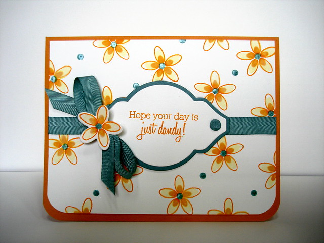
It's good to be back in Blogland after a month of mojo doldrums. Thank goodness for such great challenges as this one to get me out of the funk. This week's challenge is to use a watercoloring technique with regular ink on a stamped image.
Her's my card:

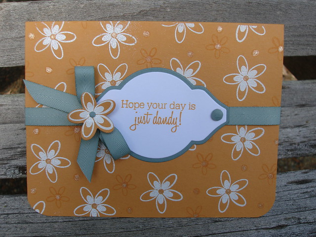
This card was a lot of fun to make and I was pleased to try a new color combo. (see details below). I liked making this one so much, I made a different version of it, just because I need two birthday cards by next week. Which do you like better?

I used heat embossing technique here on the larger flowers, and Versamark ink for the dots and smaller flowers. Near the top of the card you can see the sparkle in the dots and small flower centers made with a Sakura Stardust pen. Love that little pen!
Thanks for stopping by,
Suzanne
Details for Card A:
Cardstock-(base) More Mustard by Stampin' Up!, Vintage Cream and Ocean Tides, by Papertrey Ink
Stamps: Flower Fusion #3, Flower Fusion #8 by Papertrey Ink
Ink: Wild Honey Distress by Ranger, Ocean Tides by Papertrey Ink
Ribbon: Ocean Tides Twill by Papertrey Ink
Dies: Mat Stack #2, Layerz #2, Flower Fusion #3, all from Papertrey Ink
Tools: Corner Chomper, 1/4" hole punch, Sakura Glaze Pen, Waterpen
Details for Card B:
Cardstock: More Mustard by Stampin' Up!
Stamps: same as above
Dies: same as above
Ribbon: same as above
Ink: Wild Honey Distress by Ranger, Versamark
Other: White Embossing Powder by Stampendous, Sakura clear Stardust Pen, 1/4' & 1/8" hole punches, Corner Chomper

whow I like them both!
ReplyDeleteSo pretty, Suzanne! I love how you incorporated the dies!
ReplyDeletePretty!! Beautiful color combo. Love them both but I think number 2 is my favorite!!
ReplyDeleteBoth of these are so pretty but the colors seem to pop on the white base. Great job!
ReplyDeleteBoth of the cards are beautiful, CAS. Love the ribbon on both cards! If I have to pick maybe the top one because I like a layer around the edge.
ReplyDeleteThey are both beautiful. I like the top one better because I really like brighter colors.
ReplyDeleteBoth are lovely! You can't make me choose. lol Great take on the challenge.
ReplyDeleteSimply lovely! Colorful yet with simple lines and curves....totally rocks! :)
ReplyDelete