Monday, September 12, 2011

Make It Monday #32: Stamping with Acrylic Paint Inspiration Showcase- Day #1

Hello Everyone!  

Today was the beginning of Inspiration Showcase, an online card class by Jennifer McGuire.  I hope you are getting to learn some new techniques along with me in this fabulous class.  The first day was all about the wide variety of resist techniques; one of which was called Paint Resist using acrylic paint instead of ink.  (A technique I had never tried)  

Then I found today's MIM and had already been stamping with my acrylics!  So here is my first go at this very interesting technique.

photo

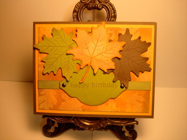
The background is stamped with cream colored acrylic paint on white cardstock.  After thorough drying, I sponged on several different distress inks to create my fall color palette.  Interestingly, I was instructed to use a slightly damp cloth to remove the distress ink from the acrylic stamping.  I misted a paper towel with water, and dabbed more than rubbed, but was amazed that it did not smear.  I was very happy with the result.  There is more acrylic paint stamped on the center leaf but no resist was used there.

Details:
Cardstocks:  PTI Summer Sunrise, SS White, Simply Chartreuse and Stampin' Up! Soft Suede
Stamps:  PTI Leaf Prints, Birthday Basics
Inks:  Ranger Distress Brushed Corduroy, Tea Dye, Wild Honey, Shabby Shutters
Dies:  PTI Leaf Prints, Mat Stack #2
Ribbon:  PTI Simply Chartreuse twill
Acrylic Paint:  Daler Rowney Cream


Wednesday, September 7, 2011

Make It Monday #31: Creating Backgrounds with non-background stamps

Hi Everyone!  

I had so much fun with this challenge-I love creating backgrounds with stamps and I am in love with my new Tabletops stamp set from Papertrey Ink.  

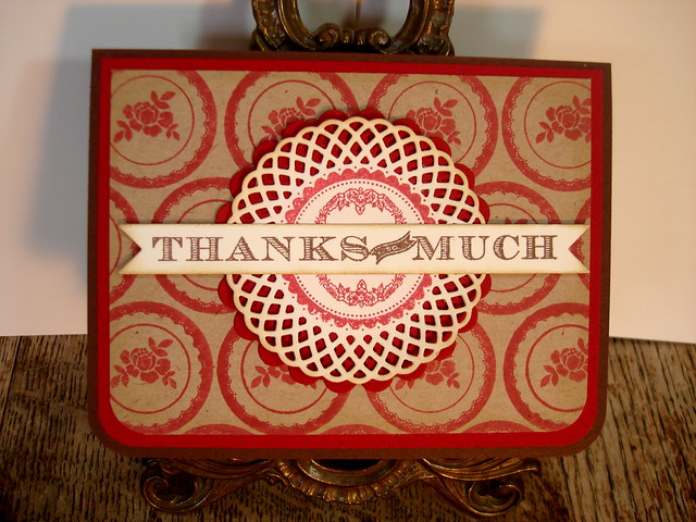
When I chose this color scheme I did so because it reminds me of fall.  However, it is also the primary color scheme in my dining room.  We don't use our dining room very often, but for the family gatherings, especially Thanksgiving and Christmas, we do and we all look forward to pulling out the china, crystal, and silver for these special celebrations in a very warm and inviting room.  I knew I felt a certain homey-ness from this card!  I hope you like it, too! 

photo

I have used a wide variety of supplies here most all of which are from PTI  except for the red cardstock which is Cherry Cobbler from Stampin Up!, the Memento Inks, Rhubarb Red and Rich Cocoa, and Spellbinders Scalloped Circles, Large die.  The card base is Chocolate Brown, and I used Kraft for the stamped image and Vintage Cream  for the Doily Details and Double Ended Banner die.  The doily center is stamped with the border image from Tag-Its #1 and the smaller design within the center is from Tabletops as well as the "Thanks So Much" on the banner.  I softened the edges of each layer with Tea Dye Duo, Chai/ Chamomile Inks and rounded the bottom corners of each layer with a Corner Chomper.

Thanks for stopping by, 
Suzanne

Thursday, September 1, 2011

CR84FN37


I love these colors!

Hello Everyone!  

I hope you are having a happy Thursday as we greet a new month and finish the third quarter of this year.  I love the change of seasons and we get all four here in central Arkansas.  In fact, Autumn is my favorite time of year.  The mild temperatures and lingering sunshine invite us outdoors to brilliant colors and textures that instill a sense of awe every time it occurs. Oh well, I guess a card with those beautiful fall colors will have to wait for another post...

Today I have this one for you!

photo

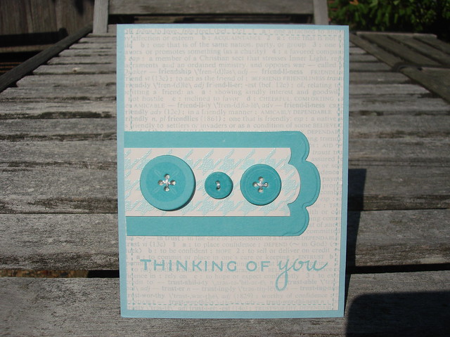
I like this challenge because I tend to put myself in a box and try to match the colors perfectly.  By using the two shades of blue, I had some freedom to use a variety of products and combine them in a way that allows them to blend rather than match.  The background stamp, Hero Arts CG125, is stamped in Colorbox Cape Cod Ink.  (My favorite soft blue for sponging  sky).  The PTI Background Basics: Houndstooth, was stamped on the ivory card stock with Versamark Ink, and heat embossed with ZING! Powder Blue Embossing Powder.  The buttons are die cut using PTI Buttoned Up #1, and stamped with Button Boutique in Versamark Ink.  The sentiment is from PTI Think Big Favorites #7 and stamped with Hawaiian Shores Hybrid Ink.  I love the font combo here-so clean and crisp.  It may be a little hard to recognize the little stitching detail around the edge of the card.  That is my answer to using a sewing machine!  There is this tiny little stamp within Button Boutique that looks just like real stitches!  I know you can't really beat the beauty and texture of thread with ink, but it does run a very close second. The cardstocks are PTI Vintage Cream and Hawaiian Shores, and the light blue card base is Gina K. Designs Ocean Mist. 

Well there you have it.  My first attempt with CR84FN.  (Can someone tell me what that stands for?)  

Thanks for stopping by!
Suzanne