Wednesday, October 12, 2011

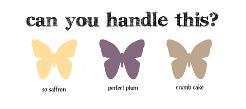
Make -It-Monday, #36 Faux Watercoloring

Hello All!
It's good to be back in Blogland after a month of mojo doldrums.  Thank goodness for such great challenges as this one to get me out of the funk.  This week's challenge is to use a watercoloring technique with regular ink on a stamped image.

Her's my card:

 photo


This card was a lot of fun to make and I was pleased to try a new color combo. (see details below).  I liked making this one so much, I made a different version of it,  just because I need two birthday cards by next week.  Which do you like better?

photo

I used heat embossing technique here on the larger flowers, and Versamark ink for the dots and smaller flowers. Near the top of the card you can see the sparkle in the dots and small flower centers made with a Sakura Stardust pen.  Love that little pen!

Thanks for stopping by, 
Suzanne

Details for Card A:
Cardstock-(base) More Mustard by Stampin' Up!, Vintage Cream and Ocean Tides, by Papertrey Ink
Stamps:  Flower Fusion #3, Flower Fusion #8 by Papertrey Ink
Ink:  Wild Honey Distress by Ranger, Ocean Tides by Papertrey Ink
Ribbon:  Ocean Tides Twill by Papertrey Ink
Dies:  Mat Stack #2, Layerz #2, Flower Fusion #3, all from Papertrey Ink
Tools:  Corner Chomper, 1/4" hole punch, Sakura Glaze Pen, Waterpen

Details for Card B:
Cardstock:  More Mustard by Stampin' Up!
Stamps:  same as above
Dies:  same as above
Ribbon:  same as above
Ink:  Wild Honey Distress by Ranger,  Versamark
Other:  White Embossing Powder by Stampendous, Sakura clear Stardust Pen, 1/4' & 1/8" hole punches, Corner Chomper 


Monday, September 12, 2011

Make It Monday #32: Stamping with Acrylic Paint Inspiration Showcase- Day #1

Hello Everyone!  

Today was the beginning of Inspiration Showcase, an online card class by Jennifer McGuire.  I hope you are getting to learn some new techniques along with me in this fabulous class.  The first day was all about the wide variety of resist techniques; one of which was called Paint Resist using acrylic paint instead of ink.  (A technique I had never tried)  

Then I found today's MIM and had already been stamping with my acrylics!  So here is my first go at this very interesting technique.


photo

The background is stamped with cream colored acrylic paint on white cardstock.  After thorough drying, I sponged on several different distress inks to create my fall color palette.  Interestingly, I was instructed to use a slightly damp cloth to remove the distress ink from the acrylic stamping.  I misted a paper towel with water, and dabbed more than rubbed, but was amazed that it did not smear.  I was very happy with the result.  There is more acrylic paint stamped on the center leaf but no resist was used there.

Details:
Cardstocks:  PTI Summer Sunrise, SS White, Simply Chartreuse and Stampin' Up! Soft Suede
Stamps:  PTI Leaf Prints, Birthday Basics
Inks:  Ranger Distress Brushed Corduroy, Tea Dye, Wild Honey, Shabby Shutters
Dies:  PTI Leaf Prints, Mat Stack #2
Ribbon:  PTI Simply Chartreuse twill
Acrylic Paint:  Daler Rowney Cream


Wednesday, September 7, 2011

Make It Monday #31: Creating Backgrounds with non-background stamps

Hi Everyone!  

I had so much fun with this challenge-I love creating backgrounds with stamps and I am in love with my new Tabletops stamp set from Papertrey Ink.  

When I chose this color scheme I did so because it reminds me of fall.  However, it is also the primary color scheme in my dining room.  We don't use our dining room very often, but for the family gatherings, especially Thanksgiving and Christmas, we do and we all look forward to pulling out the china, crystal, and silver for these special celebrations in a very warm and inviting room.  I knew I felt a certain homey-ness from this card!  I hope you like it, too! 

photo

I have used a wide variety of supplies here most all of which are from PTI  except for the red cardstock which is Cherry Cobbler from Stampin Up!, the Memento Inks, Rhubarb Red and Rich Cocoa, and Spellbinders Scalloped Circles, Large die.  The card base is Chocolate Brown, and I used Kraft for the stamped image and Vintage Cream  for the Doily Details and Double Ended Banner die.  The doily center is stamped with the border image from Tag-Its #1 and the smaller design within the center is from Tabletops as well as the "Thanks So Much" on the banner.  I softened the edges of each layer with Tea Dye Duo, Chai/ Chamomile Inks and rounded the bottom corners of each layer with a Corner Chomper.

Thanks for stopping by, 
Suzanne

Thursday, September 1, 2011

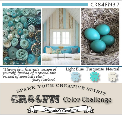
CR84FN37


I love these colors!

Hello Everyone!  

I hope you are having a happy Thursday as we greet a new month and finish the third quarter of this year.  I love the change of seasons and we get all four here in central Arkansas.  In fact, Autumn is my favorite time of year.  The mild temperatures and lingering sunshine invite us outdoors to brilliant colors and textures that instill a sense of awe every time it occurs. Oh well, I guess a card with those beautiful fall colors will have to wait for another post...

Today I have this one for you!

photo

I like this challenge because I tend to put myself in a box and try to match the colors perfectly.  By using the two shades of blue, I had some freedom to use a variety of products and combine them in a way that allows them to blend rather than match.  The background stamp, Hero Arts CG125, is stamped in Colorbox Cape Cod Ink.  (My favorite soft blue for sponging  sky).  The PTI Background Basics: Houndstooth, was stamped on the ivory card stock with Versamark Ink, and heat embossed with ZING! Powder Blue Embossing Powder.  The buttons are die cut using PTI Buttoned Up #1, and stamped with Button Boutique in Versamark Ink.  The sentiment is from PTI Think Big Favorites #7 and stamped with Hawaiian Shores Hybrid Ink.  I love the font combo here-so clean and crisp.  It may be a little hard to recognize the little stitching detail around the edge of the card.  That is my answer to using a sewing machine!  There is this tiny little stamp within Button Boutique that looks just like real stitches!  I know you can't really beat the beauty and texture of thread with ink, but it does run a very close second. The cardstocks are PTI Vintage Cream and Hawaiian Shores, and the light blue card base is Gina K. Designs Ocean Mist. 

Well there you have it.  My first attempt with CR84FN.  (Can someone tell me what that stands for?)  

Thanks for stopping by!
Suzanne

Monday, August 29, 2011

Card Pattern Sketch 130 & Color Throwdown 156


Hello Everyone and Happy Monday to you!


This project was a first time sketch challenge, a first time to use this color combination, and a first time to use NO ink!  So, I am particularly curious as to what you might think of it.  I will look forward to your much appreciated comments!  


In my stash of patterned papers, I found this 6" pad from Kaiser Craft called  Lilac Avenue Collection.  It not only has a variety of pretty papers, but 28 die cut elements.  I stacked two of them under the center flower.  The striped background as well as the soft yellow pattern under the two side flowers are also from this collection.  The roses were made using My Favorite Things Rolled Roses Dies.  The scalloped squares were made from Spellbinders Big Scalloped Squares, large.  I also used Papertrey Ink's Eyelet Lace Scallop Border die which I cut in half and adhered to either side of the horizontal strip across the center of the card.  All cardstock is from Papertrey Ink in Kraft, Lemon Mist, and Plum Pudding. 


photo


Thanks for stopping by!
Suzanne

Saturday, August 27, 2011

CASE Study #54 and...


Signature Style...inspired by a sticker


I was stumped when I received the e-mail saying that the CASe Study #54 was about Signature Style.  I took out a variety of my favorite cards from my stash and have spent the last two days staring at them.  Which of these really characterizes MY Style?  Nothing was coming to mind...then I got the e-mail from CASual Friday about using stickers.  Well, I have a grand total of 4 sheets of stickers, all alphabets with a few images thrown in.  Bought them all on sale because stickers are something I should have on hand as a card maker, right?  


My little self-conscious mind was spinning nervously as I noticed the word "Paris" and I finished the thought with "is always a good idea".  (A quote I recently heard by Audrey Hepburn)  And Voila!  My happy memories of a recent trip to Paris with my Sweet Hubby translated into this card.  We had dinner at Le Jules Verne, the fabulous restaurant inside the Eiffel Tower.  We sat next to a window and watched the sun set over Paris as The City of Lights came to life.  Ooh la la, tres magnifique!!!


I'm still not sure what my signature style is, but I thought a handwritten sentiment would be an interesting take on the challenge.  Get it?  Signature?  Oh well.  


So there you have the convoluted process I went through to get to this:

photo

Au revoir, mes amies!

Details:
Cardstock:  PTI Fine Linen and True Black
Stamps:  Hero Arts CL325
Ink:  VersaMark, Memento Tuxedo Black, PTI Smoky Shadow (aged effect)
Sticker:  The Paper Studio
The tiny hearts are die cuts from Tiny Tags Die (PTI), colored with Copic Marker RV17, and sparkled with Martha Stewart Crystal Fine glitter
The handwriting is done with an extra fine black rolling ball pen by Pilot

  Those of you in the northeast, I am praying for your protection and that you will take all of the precautions necessary regarding the hurricane bearing down on you.  Please be safe.

Thanks for stopping by, 
Suzanne

Thursday, August 25, 2011

August 2011 Bloghop at Papertrey Ink

The-Challenge
August Blog Hop Inspiration 

Isn't this a beautiful inspiration?

Here is my take on the challenge:

photo


Details:

Cardstock-PTI, Vintage Cream
Designer Paper- Bitty Blocks, Pure Poppy and Spring Moss
Ink:  Pure Poppy, Memento Tuxedo Black
Stamps:  sentiment, Gratitude Journal/ flowers, Flowere Fusion #1 & All About You/ flourish, Mat Stack #2
Dies:  Flower Fusion #1, Turning a new Leaf, Mat Stack #1

Thanks for stopping by, 
Suzanne